Looking for ways to grow your business and stand out as a freelancer?
Then you want to know about visual identity.

Visual identity is the combination of all the imagery and visual information of a brand.
As freelancers, we’d rather focus on words than on visual elements.
It encompasses several elements (such as hierarchy, imagery, and iconography), but the core of a visual identity is made up by:
- Logo
- Color palette
- Typography
All together, these elements – your visual identity – express who a brand is and what sets it apart from all others.
What Can a Strong Visual Identity Do for You?
Before we get into how to develop and use your visual identity, let’s address a doubt you might be having: “Why do we need a visual identity at all?” If that’s you, I get where you’re coming from.
As freelancers, we’d rather focus on words than on visual elements.
And after all, we are not big companies selling physical products, right? Given all that, do we still need to spend time and energies learning how to best develop a visual identity?
Yes. Absolutely. And here is why.
A Consistent Visual Identity Makes You Stand Out
Let’s clear up a common misconception: visual identity is not just for A-league brands.
That would be like saying that business cards are just for C-suite professionals. A visual identity is a visual rendition of what your brand is about.
As such, any brand needs it, including yours (yup: as a freelancer, you are an entrepreneur and have a personal brand).
Having a distinct visual identity sets you apart from competitors and makes you recognizable – at a glance. And in the age of the internet – when countless professionals are battling for their customers’ attention – this is an ace you want to have up your sleeve.
A Well-Crafted Visual Identity Makes You Look Professional
Good clients won’t hire a hobbyist.
So if you want to promote your brand and attract the right type of clients (the ones that don’t pay peanuts), you must make sure they see you as a pro. And optics are essential.
Spending time crafting your visual identity will impress your potential customers and demonstrate you are serious about the job. Conversely, not having a purposeful enough visual identity can affect your credibility and, ultimately, your business.
A Strong Visual Identity Wins People Over
Listen: I know that saying it to a freelancer is tantamount to blasphemy, but a book is judged first and foremost by its cover.
Of course, you need stellar skills to succeed as a freelancer – I’m not suggesting that good design can make up for those.
But the way you present your brand and yourself does affect the way people perceive you.
‘Cause before they read a single line of your copy, leads will take in your website color, your logo and the imagery you use.
You want these elements to work in your favor, to seduce and captivate your reader… even before he or she has read a word. And there’s no way you can achieve this goal if your brand visuals are messy and inconsistent.
How Can I Create a Powerful Visual Identity – For Free?

Since visual identity is such an important asset, you might think it takes a pro, loads of time, and even more money to build one.
But the good news is, it doesn’t have to be this. In fact, I’m here to show you how to build your visual identity on your own, using free tools (I’ll focus on Canva since it’s effortless to use, but feel free to use whichever graphic tool you like best).
Let me be clear: I’m not saying the results you can get using free tools are as good as those a professional graphic designer can deliver. That would be like saying, “everyone can write copy.”
What I am saying is that free tools are enough to get you started. The result won’t be perfect, but perfection should never be an excuse for inaction. Once you have a basic visual identity, you can always make adjustments or hire a pro.
You could even trade services with a graphic designer (writing her copy in exchange for a hand in making your visual identity even more unique)! In the meantime, here are some basic notions to help you out.
Before You Start
Before we delve into the various elements that make up your visual identity, let’s focus on a few key rules you should keep in mind when developing it.
Do Your Research
Your visual identity is a reflection of your brand and not the other way around.
So before you set out choosing colors and fonts, reflect on the message you want to convey and think of the audience you are addressing. Let’s be clear here: you don’t have to suppress your personality to please your prospects.
You can be quirky and write about finance, healthcare and luxury goods: just focus on conveying your authority and build your visual identity accordingly.
Look Around for Inspiration
When you’re new to the game, you may not know what type of clients you’re going to work with.
You might still be in the process of figuring out what’s unique about you!
If that’s the case, don’t worry.
You can always look around for inspiration, and see what other names in your industry are doing (since we’re among adults, there’s no need to state that “getting inspired” and “copying” are two very different things, right?). For example, suppose your niche is digital marketing. In that case, you can study sites such as Ubersuggest, CMI, Hubspot or Backlinko (something you’re probably already doing for other reasons).
These brands tend to stick to solid colors and opt for a monochromatic color scheme and minimalist typography. Since your audience is probably familiar with this type of visual identity, creating something similar is a good starting point.
Be Consistent
Spoiler: you’ll hear me mention consistency around a thousand times in this article – and there’s a reason why.
The whole point of visual identity is to make your brand recognizable. You won’t achieve that goal if you keep changing your visual identity elements (that would be like giving a new name every time you meet something and expecting people to recognize you…).
Make sure your elements all work together, and use them consistently across platforms (more on that later).
Don’t Overthink
I know this kind of contradicts everything I’ve said so far, but overthinking is the key to inaction – and ultimately, to failure. As with everything business-related, embrace the possibility you’ll make mistakes and grow from them.
No one was born having everything figured out. We all learn as we go, and your visual identity is no exception. Remember that if something in your visual identity doesn’t work – or if you come to dislike it – you can always make adjustments. With all that out of the way, let’s see the must-have elements of your visual identity.
1. Logo
 More than any other element, your logo will identify your brand and make it recognizable – and recognized.
Hefty stuff, isn’t it?
If the thought of forever ruining your business by choosing a less-than-stellar logo is keeping you up at night, remember that – like any other piece of your visual identity – your logo isn’t set in stone (Unless you choose to have it carved in marble and placed at the entrance of your mansion.To each their own).
It’ll change and grow as your brand changes and grow, so you’re always free to make adjustments.
Now that we’ve taken some pressure off your chest, let’s look at the various forms a logo can take.
Logos can be:
- Symbols (think Nike, Apple)
- Stylized names (Coca Cola)
- A combination of both (BMW, Burger King).
Choosing which form you want for your brand is totally up to you.
Just keep in mind that, as evocative and distinctive as symbols are, designing them requires more skills than simply writing your name (or pen name) in a nice font. Said otherwise, stylized names might be more accessible for beginners.
Whatever you choose, make sure your logo is simple enough to work in smaller sizes.
If one needs a high resolution to make out your logo’s details, you might want to rethink it. Last but not least, you want to be consistent.
If your logo is in color, then you’ll want to stick to that palette even when designing other elements of your visual identity. If your logo has a wordmark, your whole typography has to harmonize with the font(s) you’ve chosen.
How to Design a Logo with Canva
To get started, simply type “Logo” in the search bar, and browse through the layouts.
If you are afraid that an existing layout isn’t original enough, remember you can customize them at will, by changing symbols, fonts and color palette. The layouts are just a starting point: experiment until you find something that appeals to you. 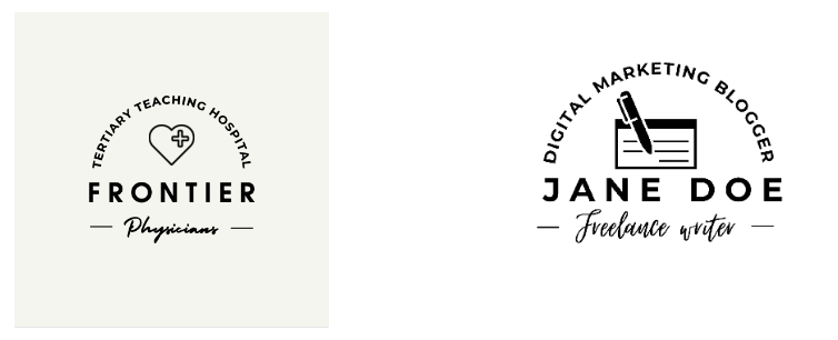 On the right is a logo I made by customizing an existing layout (left).
As you can see, I enlarged the size and changed the sub-headline font to make the reading experience easier. I’ve also chosen a different symbol, one that’s more in line with our business.
You can do the same by clicking on “elements” in the left sidebar and then typing the kind of element you’re looking for into the search bar (try options such as “pen”, “pencil”, “writing”). Will this logo win me an award? Absolutely not. But customizing it took less than 10 minutes, and it does the trick. Remember: you can work on a bad logo. You can’t work on thin air.
2. Colors
Color is a core element of your visual identity.
It’s among the first elements the human eye perceives and can evoke deep emotional responses.
When choosing your color palette, remember that less is more.
Sporting several colors can be confusing and counterproductive, as it’s guaranteed to make your audience feel overwhelmed. Limit yourself to three or four colors maximum: one main color, one accent color, and one or two complementary colors. When deciding which colors you want to incorporate into your palette, you can experiment or rely on one of the following color schemes:
Monochromatic Color Scheme
Choose a hue on the color wheel: this will be one of your palette colors (up to you to decide if main, complementary, or accent). Use shades (same hue with black added) and tints (same hue with black added) of the same color to complete your palette. 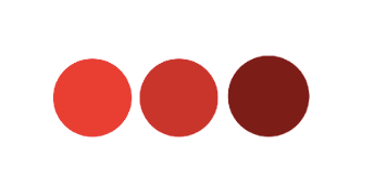
Analogous Color Scheme
This color scheme includes colors found side by side on the color wheel. There’s more contrast here than in a monochromatic color scheme. Still, the hues are similar enough not to clash with one another. 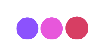
Triadic Color Scheme
If you’re a little more daring, you can try the triadic color scheme, which uses three hues evenly spaced on the color wheel. This high-contrast combination is not as easy to pull off as the other two I’ve mentioned, but if you have a personality to match, go for it! 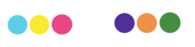
Split Complementary Color Scheme
Complementary colors are the ones opposite one another on the color wheel.
These colors create a strong, not always pleasant contrast. If you would like something more accessible, opt for a split complementary color scheme, which groups a color with the two colors next to its complement. 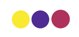 Whichever color scheme you opt for, keep in mind that high-intensity colors can fatigue the eye when seen through a screen. It’s better to use them as accent colors and choose something more muted as your main and complementary color.
As always, consistency is key: your color palette should be the same for everything brand-related, from your logo to your website down to your business cards. See how Coca-Cola is consistent in using red throughout their website?
By doing so, they create a very cohesive, powerful aesthetic. Just think how different – and way less convincing – the effect would have been if the model had worn a blue shirt. 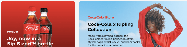
3. Typography
Typography refers to the style and appearance of the text you use for your personal brand. It includes fonts, types, and text arrangement. Ideally, you want your typography to be:
Not Overwhelming
If you had the misfortune of being a teenager in the age of Blogspot or Tumblr, you’re probably still traumatized by blogs changing fonts and text colors with every post. Don’t do that, please.
It’s off-putting and gives off an unprofessional vibe. Limit yourself three fonts – a headline font, an accent font and a body copy font – and use them consistently.
Easy to Read
Using a distinctive and unique font is great, but it shouldn’t come at the expense of your readers’ experience.
Your body copy, in particular, should be very easy to read. If most of your brand-related writing is going to happen online (for example on your website), you’ll want to opt for a Sans Serif font such as Ariel, Geneva or Helvetica.
Sans Serif fonts are smoother and easier to read online than Serif fonts (in case you’re wondering, a “serif” is that little anchor finishing off the letter’s stroke). Fun fact: even Google opted for a Sans Serif logo, discarding its previous Serif one.  As for script fonts (fonts mimicking handwriting), my advice is to only use them as accent fonts, as Elna Cain does on her personal blog.

Consistent With the Other Elements Making Up Your Visual Identity
No, this doesn’t mean that you have to use your logo’s font as your headline font (if you look at the screenshot from CocaCola’s website, you’ll notice they don’t, and with good reasons.)
What you want to do is harmonizing the various elements of your visual identity. So if your logo uses a script font as its wordmark, you’ll want to stick to that same script font when choosing an accent type.
Ps. If you feel all this advice is overwhelming, and you don’t know where to start, take a deep breath and relax: as long as you avoid Comic Sans at all costs, no mistake is too bad to be fixed.
4. Design Elements
Design elements are optional, but they can really give an edge to your visual identity. They can be cartoon characters, shapes or symbols; you can draw them or find them on Canva (just browse the “element” section on the left sidebar).
Design elements can be featured on your website or on your social platforms.
Where Can You Showcase Your Visual Identity?
Now that you know what visual identity is and why it’s critical to build one, you might still wonder where and how to showcase it. The answer is simple: wherever and whenever your brand is involved.
The most obvious place – and one I’ve mentioned throughout the post – is your website. The website colors and typography should be the same you’ve chosen for your visual identity. Your logo should be your site icon.
Tip: if you use WordPress and want to use your logo as the site icon, simply follow these steps:
- Go to the WordPress editor
- Select “Customize” and then “Header”
- Scroll to the bottom of the page until you see “Choose site icon”
- Upload your logo
- Don’t forget a search engine-optimized Alt text. If you use a wordmark as your logo and it’s too long to fit in as a site icon, you can use a simplified version that includes just one or two letters.
But what if, for whatever reason, you don’t have a website?
First, get one, and second, you can still showcase your visual identity on your social platforms. If you are on LinkedIn, Facebook, or Pinterest, customize your cover image so that it includes your logo and the color palette you’ve chosen.
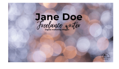
I recommend using the same cover image on all social media to make it easier for your readers to recognize you. For example, Jane Doe could use a Facebook cover like this one (adding her contact info to make it easier for prospects to reach her).
But visual identity doesn’t just come into play with cover images.
You could make branded posts for Instagram or LinkedIn, or use your logo to mark your YouTube videos. 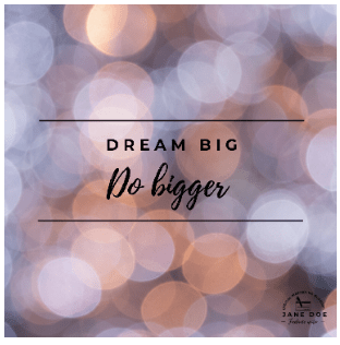 A thing I do is designing a banner for all blog posts I publish on LinkedIn Pulse.
In addition to being visually appealing (or so I hope!), this trick helps me standing out, which is crucial on a platform like LinkedIn.
As you can see, there are endless options for showcasing your visual identity once you’ve built one.
You don’t have to do everything (I’m still internally debating whether Instagram posts are cheesy or genius, for example), but whatever you’ll do will give you an edge and make your brand look professional and impactful.
Developing Your Visual Identity is Worth It
If you are serious about your business as a freelancer, you need to develop all aspects of it – including your brand’s visual identity.
Having a strong and purposeful visual message that stays consistent across your platforms will make you look more professional and help raise brand awareness.
Building a visual identity is easier than it might seem at first glance (see what I did here?), and thanks to tools like
Canva you can do it entirely for free. So… what are you waiting for?
Let my know if you have questions or comments – or creative ways to showcase your visual identity!


2 Comments